Mobile Friendly Test
Check if your website is mobile-friendly with this free online Mobile Friendly Test tool. Enter your site URL and instantly preview how it appears on smartphones using a live mobile simulator. Fast, accurate, and private — no signup or software required.
Share on Social Media:
Mobile Friendly Test – Free Responsive Website Checker
Today, over 70% of all web traffic comes from smartphones — and if your website isn’t mobile-friendly, you’re losing visitors, sales, and SEO rankings.
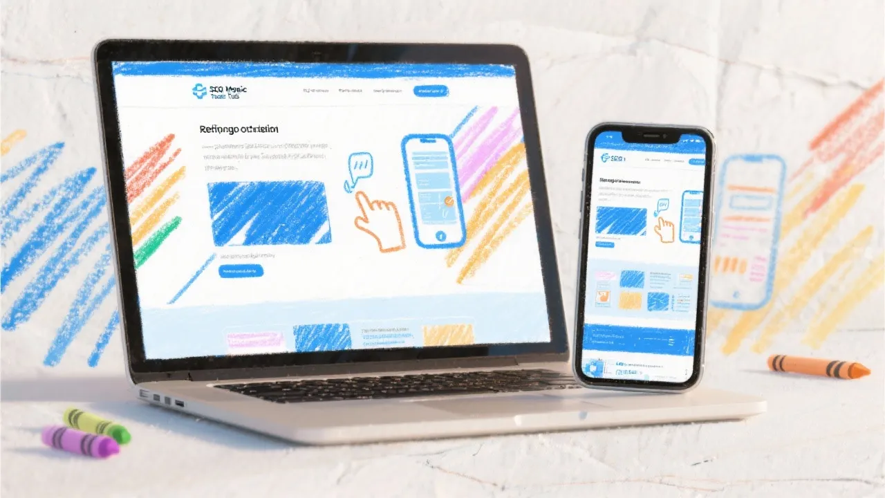
The Mobile Friendly Test by SEO Magic Tools helps you instantly check whether your website is responsive and optimized for mobile users.
Simply enter your website URL, click “Start Test,” and watch as your site opens inside a realistic mobile device simulator. You’ll instantly see how your pages look, load, and perform across different screen sizes.
It’s fast, free, and privacy-focused — no data collection, no installation — just instant mobile testing in your browser.
🔹 What Is a Mobile Friendly Test Tool?
A Mobile Friendly Test Tool is an online utility that lets you preview and analyze how a website appears and behaves on smartphones or tablets.
It helps you evaluate:
Responsive design: Does your layout adjust properly on smaller screens?
Content scaling: Is your text readable without zooming in?
Navigation usability: Are menus and buttons easy to tap?
Overall user experience: Does your website feel smooth and accessible on mobile devices?
The SEO Magic Tools Mobile Friendly Test offers a live mobile simulation, giving you a real-time, visual representation of your site inside a phone frame.
🔹 Why Mobile Friendliness Matters
If your site isn’t mobile-optimized, it affects more than just user experience — it impacts SEO rankings, engagement, and conversion rates.
Here’s why testing your site for mobile compatibility is essential:
Boosts SEO Performance: Google prioritizes mobile-friendly websites in search results.
Improves User Experience: Visitors stay longer when sites are easy to use on phones.
Reduces Bounce Rate: Responsive layouts keep users engaged.
Increases Conversions: Mobile-friendly designs convert better for eCommerce and lead generation.
Reflects Professionalism: A responsive site shows your brand cares about usability.
In short — if your website doesn’t look good on mobile, your business doesn’t look good online.
🔹 How It Works
The Mobile Friendly Test by SEO Magic Tools uses a browser-based mobile simulator that renders your website in real time.
Enter Your Website URL: Type or paste your site’s address (e.g., https://yourwebsite.com).
Click “Start Test.”
Live Simulation Begins: Your website loads inside a realistic smartphone frame.
Check Responsiveness: Scroll, navigate, and preview how the site looks and behaves on mobile.
Everything happens right in your browser — no API calls, no external rendering, and no data tracking.
🔹 Key Features
✅ Live Mobile Simulation: Instantly preview your website inside a smartphone frame.
✅ Responsive Design Check: Detect layout and content scaling issues.
✅ Privacy-Focused: All tests are performed locally in your browser.
✅ Instant Results: See how your site behaves on mobile within seconds.
✅ Cross-Device Preview: Test various screen sizes and orientations.
✅ Free Forever: No signups, subscriptions, or hidden limits.
✅ Developer-Friendly: Great for frontend testing and debugging.
🔹 Benefits of Using SEO Magic Tools’ Mobile Friendly Test
Accurate Live Preview: See exactly what mobile users see.
Improves SEO Readiness: Optimize for Google’s mobile-first indexing.
Zero Setup: No app, extension, or login needed.
Lightweight & Fast: Loads instantly in your browser.
Supports HTTPS Websites: Works smoothly for all domains.
Professional Interface: Clean, distraction-free, and ad-free.
🔹 Step-by-Step Guide
Visit SEO Magic Tools – Mobile Friendly Test.
Enter your website URL in the input box.
Click “Start Test.”
Wait a few seconds — your site will appear inside a mobile simulator.
Scroll, click, and interact to check responsiveness and layout behavior.
Use this tool to quickly spot any alignment, text, or layout issues before launching your site or updates.
🔹 What the Tool Helps You Analyze
📱 1. Mobile Layout:
Check if the site’s structure adjusts correctly to fit mobile screens.
🧭 2. Navigation Menus:
Ensure your menu buttons are visible and touch-friendly.
🔠 3. Text & Font Size:
Verify that text is readable without zooming or horizontal scrolling.
🖼️ 4. Image Scaling:
See if images resize properly and load smoothly.
⚡ 5. Page Speed Feel:
Experience your site’s loading behavior on simulated mobile conditions.
🧩 6. UI Elements:
Buttons, sliders, forms, and modals — make sure everything works as expected.
🔹 Real-Life Use Cases
💻 Web Developers: Test responsive designs and media queries before deployment.
📈 SEO Professionals: Evaluate mobile readiness for Google ranking.
🎨 UI/UX Designers: Validate mobile layouts and spacing visually.
🏢 Businesses & eCommerce Owners: Ensure your site delivers a flawless mobile experience to visitors.
🧑💻 Freelancers: Present mobile design demos to clients easily.
🔹 Technical Overview
Input: Website URL (HTTP/HTTPS)
Output: Live website preview in smartphone simulator
Rendering Engine: Browser-based iframe simulation
Processing: 100% local (no data storage)
Compatibility: Supports all major web browsers
Responsive Check: Viewport-based rendering
Testing Environment: Interactive mobile layout view
🔹 Why Choose SEO Magic Tools?
SEO Magic Tools is trusted for providing privacy-first, developer-grade online tools that make technical testing easy and accessible.
Here’s why this Mobile Friendly Test stands out:
✅ No tracking or data sharing
✅ Real-time visual testing
✅ Free, accurate, and unlimited use
✅ Fast performance and modern UI
✅ Ad-free experience for professionals
With this tool, you can ensure that your site is not just mobile-compatible — but mobile-perfect.
🔹 Similar Tools You Might Like
Website SEO Score Checker
Page Speed Test
Broken Link Checker
Responsive Design Checker
Screenshot Capture Tool
All SEO Magic Tools share the same mission — Speed. Privacy. Accuracy.
🔹 FAQs
1. Is the Mobile Friendly Test free?
Yes, completely free with unlimited use.
2. Does this tool show a real mobile preview?
Yes, it opens your site inside a realistic smartphone frame to simulate mobile browsing.
3. Can I interact with the preview?
Yes, you can scroll, click, and explore your website as if on a real phone.
4. Does this test store my website data?
No, all rendering is done locally in your browser — nothing is uploaded.
5. Can I check multiple websites?
Yes, just enter a new URL to test another website instantly.
6. Does this tool test page speed or SEO?
This tool focuses on visual and layout responsiveness. For SEO performance, use the “Website SEO Score Checker.”
7. Does it support HTTPS and dynamic pages?
Yes, it supports all modern website types.
8. Is it mobile and desktop compatible?
Yes, you can run it on any device or browser.
🔹 Final Thoughts
The Mobile Friendly Test by SEO Magic Tools is a must-have utility for anyone who designs, builds, or manages websites. It gives you an instant, realistic mobile preview of your site, helping you ensure that every page looks great and performs smoothly on smartphones.
By using this tool, you can confidently deliver responsive, mobile-ready websites that meet modern SEO and user experience standards — without needing any external software or complex testing setup.
🚀 Try it now at seomagictools.in/mobile-friendly-test — and see exactly how your website looks on mobile devices in real time, free, and securely.